There are a lot of factors that go into the making of your brand. Every decision you make will determine the impression your brand makes on customers.
That’s why we’re here to help you make important decisions regarding your font. Below, you can read all about what font says about your brand. This will help you determine which to lean toward when choosing your printed and digital look.
Font and Your Brand
Your brand’s font says everything about your brand. As a general rule of thumb, you shouldn’t include more than three font styles in your brand or ads surrounding your brand. That’s because more than three can confuse your customers more than anything, and it prevents your brand from having a clear goal or impression. Less is more when it comes to the number of fonts you choose.
Using bolder fonts will make your brand appear bolder, which might be the impression you want to give. Bold brands stand out, and they tell their audience that the brand has something to say. Companies that focus on empowerment like to use these fonts because they serve as a call to action.
Serif Vs. Sans Serif
The idea behind serif and sans-serif fonts is pretty simple. The serif is a little line on the end of letters that makes them more clear to read. It would make sense then that sans-serif fonts don’t have the little bars.
While serif fonts make letters easier to read, sans serif fonts are bolder when enlarged. In comparison, serif fonts can be a lot to take in if they’re too large, and sans serif fonts can look very smudged when they’re small because there are no lines to differentiate one letter from the other.
It’s best to use sans-serif fonts for large titles. If you’re creating an ad, you might want to use sans serif fonts as title and serif fonts for more minor descriptions within the ads themselves.
Serif fonts are excellent for detail. When you have small writing making up shapes or adding elements to a digital marketing services ad, you can use serif to ensure it’s still legible.
Examples of serif texts include the following:
- Times New Roman
- Georgia
- Palatino
- Garamond
Sans serif texts, on the other hand, include the following:
- Arial
- Helvetica
- Tahoma
The Colour of Your Font
You should also be aware of the impression the color of your font makes on your brand. Usually, companies prefer to stay with the color black for blocks, newspapers, and other printed materials. That said, you can and should include other colors to emphasize specific words.
If you have the word “strong” placed at some place in your brand, you might consider writing it in the color red or blue. That’s because red demonstrates passion and strength while blue demonstrates calm confidence.
Conclusion
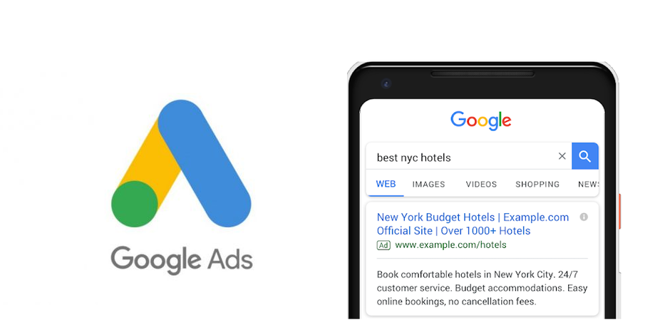
In the world of marketing, everything you do says something different about your brand. If you have very bold colors in your Google ads, it won’t make sense to use calligraphy for your font. That’s why the font you use is essential regarding the message you want to provide.
In short, you should consider using serif fonts if you want more detail, and sans serif fonts to have a font that demands attention and strength. We can help you pick the right font for your next marketing campaign. For more information on what we can do for you and your business, contact us today.


