Our Blogs

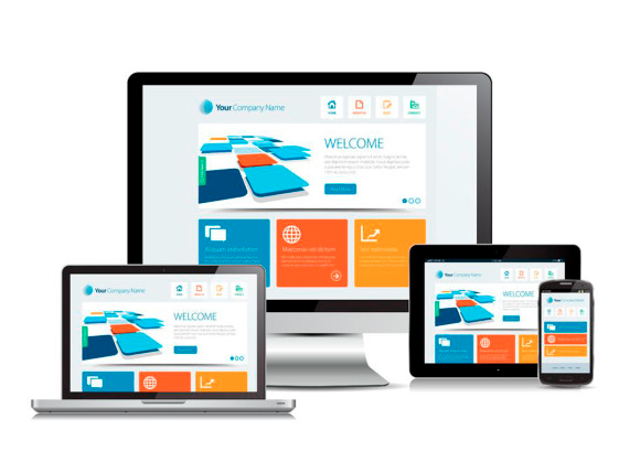
You’ve probably heard much about making your site mobile-friendly. It is, after all, one of the most important aspects of web design and SEO. 

But why is it vital to your brand? And what does a mobile-friendly website actually look like?

Today, we’re exploring why you MUST have a mobile-friendly website in 2022, how to determine whether your site is actually mobile-friendly, and what steps you can take to improve the site experience for your users. 

Why do I need a mobile-friendly website?

Not sure why you should focus on making your site more mobile-friendly? Consider: 

  • 57% of all web traffic is from mobile phones.
  • Over half of smartphone users have discovered a new product or brand online while searching on their phones.
  • By 2025, almost 75% of users will only use their phones to search the internet. 

Not to mention that. Eventually, Google will finish its mobile-first indexing, meaning that your mobile site will be the one that is indexed and shown to users regardless of device. 

(The exception is sites with separate desktop and mobile URLs. Google will then show mobile users the mobile version and desktop users the desktop version.)

This means that not having a mobile-friendly site will result in a loss of visitors, conversions, and (most importantly) profit. 

Is my website mobile-friendly?

Not sure your website is up to scratch? Google provides a free mobile-friendly testing tool that will tell you exactly where you stand. 

It also takes a screenshot of the mobile version of your site so that you can see what your users will see and a list of recommendations that you can use to improve the experience. If your site just needs a few tweaks, this is less urgent. If the list is super long? Make making a mobile-friendly site your number one priority. 

If you’ve created your site yourself, many website builders will offer an option to look at and edit the mobile version of your site. Think of yourself as a user and see how easy the site is. You can also ask some of your employees or friends to take a test drive and provide feedback. 

If you’ve gone with a professional web developer, it is most likely that they will have already taken mobile-friendliness into consideration. Even so, it is best to check using the free tool to make sure that your designer has implemented a mobile-friendly design. 

Does being mobile-friendly help my SEO?

Mobile-friendliness is a ranking factor determining where your page sits on the results page. Since 2015, Google has stated that mobile-friendly sites receive priority as they provide content that is more easily accessible and viewable for a majority of users. 

As such, any SEO strategy must consider mobile-friendly web design to maximize a website’s potential. 

What makes a mobile-friendly website?

You’ll need to consider many things to make your website more mobile-friendly. We’ve listed some of the most common and easily implemented below. 

Responsive design

A responsive design shifts depending on the size of the screen being used. This means that text and other assets will be displayed in a way that is suitable to the screen being used. Therefore, responsive design is ideal for mobile phones, tablets, and computers. 

Responsive design is the minimum organizations should aim for when creating a mobile-friendly website. Google has specifically recommended having a responsive design for your mobile site, which can affect your ranking. 

Viewport meta tag

By having a viewport meta tag, you tell the browser that the width of the user’s screen should be considered the page’s full width. This means you can control the display better and optimize your site for narrower mobile screens. 

A viewport meta tag looks something like this:
<meta name=”viewport” content=”width=device-width, initial-scale=1″>

Simple design 

With a mobile web page, you have limited space to display content. Stripping things back and creating a simple and clean design is almost always the best.

Think: what is the primary goal of the page? Are users looking for a specific resource? A particular piece of information? Contact details? Make this super-easy to find, and you’re more likely to satisfy the user and take them to the next stage of their customer journey. 

You’ll want to limit form fields and text input to only necessary, as these can frustrate users and be challenging. 

Easy navigation

When searching for information on a phone, people want answers, and they want them fast. Your site should speed things along and help them reach their destination sooner.

This means that you’ll want to limit the number of pages displayed to users – keep things simple with the 4-8 most important that your users will need. The guidelines are a little different for eCommerce sites, which will naturally have more options, but care should still be taken to simplify the process and make navigating the site as easy as possible. 

Alternatively, you can follow Amazon’s steps and leverage the search bar. This is an easy way for users to simply ask for what answers they seek and be brought to the page straight away. 

Button size is essential – you don’t want them to be too big or obnoxious, but they must be decently sized so your users can easily click on them with a thumb or finger. Alternatively, you don’t want them to be too easy to click, which can frustrate viewers as they venture through your site. 

Above all, your site navigation should be intuitive. Users should be able to know exactly where the menu options will take them and where the information they need will be. 

Pop-ups

While annoying to most users, pop-ups are incredibly damaging to a mobile user’s experience. Not only do they block the information they’re trying to read, but they can make a user leave your page straight away rather than make an effort to close the pop-up. 

If you want to include a pop-up, you can set it up so that it is only displayed once a user reaches the end of the page, directing them where to go next or if they are about to close the tab. 

Site speed

Think site speed isn’t a big deal? Consider this: if your site takes more than 3 seconds to load, you’ll lose more than half of your mobile web visitors. 

Not only is site speed essential for mobile users, but it is also a critical ranking factor for Google. As Google wants to provide the best user experience, it will prioritize sites that are faster to load and give users the information they need. 

Site speed is so important that it is considered a Core Web Vital

You can use Google’s PageSpeed Insights to find out how fast your site is and how to improve. 

Image size

Large images and videos can take a while to load on mobile, as these devices have far less bandwidth than computers. By shrinking the file size, you can improve loading times and users’ experience. 

You may also want to limit images and videos to those needed. This will help your site load faster and ultimately ensure that users can start searching your site without delay. 

Large font

You don’t want your users squinting at their screens. And while they can zoom in, many users won’t take the time and will simply click that back button. 

Large font is always best for the mobile version of your site. As a general rule, you should aim for a 16-pixel font size for maximum readability. Your font should be easy to see against your background with enough contrast. 

You’ll also want to stick with standard fonts that are easy to read in order to cut down on loading times. 

Make your site mobile-friendly today.

So there you have it. You need to make your site mobile friendly, and you need to do it ASAP. You can start by doing the following:

  • Implement a responsive design
  • Use viewport meta tags
  • Keep the design of your site simple and easy to navigate
  • Eliminate pop-ups
  • Improve your site speed
  • Use smaller image files and eliminate unnecessary images/videos
  • Use a large, easy-to-read font

It’s important to note that mobile web design best practices are constantly evolving, meaning that creating a mobile-friendly site is not a one-and-done deal. To ensure that your site is still meeting the needs of users, you’ll need to do regular testing and keep up to date with the latest trends. 

Looking to make your website more mobile-friendly? Get in touch with our expert SEO Sydney team, and we’ll be happy to help you identify your next steps!


Getting your website design nailed on perfectly is not easy. Most of the time business owners think they got it the way they want it, but it’s far from the case. Many owners don’t realize the mistakes they are making when creating their websites – and it’s hurting their business and its online reputation. As website designers ourselves, we know what mistakes business owners should be looking out for and we have listed them for you, so you too don’t fall into the same trap.

Your design is too busy or flashy.

A website should be easy upon a user’s eye. Most users know what they want when they click on your page; it’s up to you to make it easy for them to see it. This includes everything from having proper high-quality images to the perfect size texts (too small means too hard to read; too big means you lack proper content). Nailing down the right color scheme, logo, and layout is essential. Having a website that is too flashy, busy, overloaded, or in the opposite manner, too empty, too dull is going to turn off your future customers from using your site.

Navigation is a mess.

You have to make it easy for your users to search through your website design. What turns users off from coming back to your site is the difficulty for them to find what they want. Navigation should be seamless and easy, guaranteeing that users stay on your site longer and return more often.

Where’s the clear call to action?

Why are users on your site in the first place? You’ll have to figure that out, and when you do, you’ll have to make them get active on your website by establishing a “call to action”. That could be a button to press to buy a product, contact you, subscribe to your monthly newsletter, or submit a quote. The call-to-action signal must lead your users to the next step of the purchasing process.

Keeping your website updated.

Imagine you jump on a website and see that the last post, update, or advertisement is several months old. Aren’t you going to think that the business is done and dusted? Users, and potential customers, jump on your website with the hope that they contain the latest information. When it doesn’t, they think you’re out of business, you’re too lazy to update your website, or worse, you just don’t care. Keep updating it with fresh content from your business activities, however minor they might be.

That homepage represents you!

The homepage is the hardest and essentially best page you have to create. Why? Because it represents everything your business stands for: what you offer your customers, how you plan to give it to them, and why they should stay and continue to come back to your site. Your homepage has to be all about your business.

Where’s the mobile version?

Let’s face it: people use their mobile phones for the Internet more than their actual computers. One of the biggest killers for small businesses is not having a mobile version of their website. The hassle of stretching out the screen to find what they want and the difficulty of navigating through a non-mobile-friendly website can completely kill a user’s experience. Make sure to get your website “mobile friendly” as soon as possible because users are bound to find it on their phone instead of their computer.

The boom of the Internet and the conversion of business practices to the online world has meant an increase in digital marketing jobs. Of course, as with the case of an exciting, booming industry, more and more individuals are looking to break into it. We understand it is tough enough in this day and age to get a job in any field, let alone one specifically tailored to the digital field.

As professionals in the digital marketing world, we’ve gone through what you’re going through now, which is why we are ready to offload some valuable advice to make you stand out in the hunt for a digital marketing job.

Get that Experience Under Your Belt.

They say p’s get degrees, but degrees don’t guarantee jobs. In this day and age, experience is critical, so get it anyway and anywhere you can.

Ask online marketing companies and businesses for some work experience, pro-bono work, or, if you’re lucky, a cadetship. Ensure you gain valuable experience in the field – not just getting your boss a coffee. Work hard, gain experience, learn what your future job and career might entail, and add it to your resume (your online resume – but more on that below). When you finally get called into that job interview, you will have something concrete to show for your years of hard work.

Get that Experience Yourself.

Starting up a blog or a website with a portfolio only costs a handful of dollars and a few hours of commitment per week.

Your blog might not be that good, or your website might fail miserably, but in the long run, it pays off and puts you ahead of the chasing pack. Why? It shows initiative, commitment to building something from the ground up, and, more importantly, the desire to market yourself, your idea, and your beliefs.

Leave an online trail.

If you want to get into the online digital world, you must leave a paper trail of your online exploits. Get a Twitter handle and post about your work and your passions. Get two Facebook profiles – one for your work and one for your personal life. Update and get your LinkedIn profile loaded with the experienced needed. Show employers that you understand you know how to use these platforms and other online media. Show them that if you are given a job in the online world, they already know the basics.

Avoid Stupidity Online

Above, we mentioned “online exploits,” and we mean that in a professional and proper sense. Having a drunk photo as your Facebook profile picture is not going to help your cause. Employers are going to search you on Google to see who they are dealing with, and we’ve all read and heard stories of people getting sacked for stupid online posts. Be wary of what you put online.

LinkedIn Profiles are the new resume.

Facebook might be considered the behemoth of social media, but LinkedIn is the one that most employers are going to try to search for first. Make sure yours is immaculate. Keep it short, sharp, and loaded with all your online projects over the years. Make sure you tailor your profile to the industry and the career you are searching for. There is no need to mention your first job at Coles on Linked In. Also, ask for references and recommendations.

Most employers will ask for an emailed copy of your resume when you’re applying for a job and will search for your LinkedIn profile. There have been times when the two aren’t aligned or entirely different. This will damage your reputation because your employer won’t know what’s true. Ensure that your resume matches your LinkedIn “resume.”

Engage Yourself with the companies.

Retweets, comments on Facebook or blogs, re-pins, and so forth. Ensure your employers know you are interested in their company and the industry. It is all about networking, and employers want to see that you are keen to learn more and want to join the industry.

Read, Read, Read, and Understand.

Do you know what SEO means? Or PPC? Do you know which social media platform is better for one business than another? Which Web 2.0 features are best for specific projects? The online world is filled with vital information, and you must be always reading. Read blogs, read articles, read magazines about the online world, everything from SEO to blogging. The more you know, the better it is for you when you go for that interview. Employers want to see that you know the field. Read and learn.


As we mentioned in late March, beginning April 21, Google will switch its ranking style by utilizing “mobile-friendliness” as a ranking signal. With this new method, it is imperative that businesses get on board with mobile responsive designs for their website. Otherwise, they could be left behind by competitors who are adapting. However, Google’s new ranking practices are not the only reason why business owners and leaders should be eager to have a mobile responsive design; there are plenty of reasons that lead us to determine that mobile is the preferred form by which people consume the internet.

The Facts

The growth of mobile usage has been exponential over the past few years. Last year, According to CNN, for the first time in history, the usage of mobile apps exceeded the usage of desktop websites. This change is not inherent in the fact people do not have access to desktop computers but instead due to the rise and convenience of mobile devices among people everywhere.

Why Should You Care?

In order to understand the importance of mobile responsive website design, think about your daily internet experience. How likely are you to become a recurring visitor to a website that does not operate correctly? Furthermore, how likely are you to become an actual customer of an SEO company in Melbourne whose website does not function correctly? This is precisely the mentality that all consumers have when seeking services over the web, whether through their desktop or mobile. However, when we take into consideration that most people are accessing the web through portable devices, does it not seem important to make sure that every user who visits your business’ website from their smartphone or tablet encounters a flawless experience?

How Does it Work?

As opposed to having a separate URL for a mobile site, with a responsive web design, a single URL can be utilized no matter what device is used to access the website. Responsive design examines the space which is allotted for viewing purposes and then proceeds to adjust the size of the display. This means that no matter where the website is accessed from, the quality of the content and graphics will not be diminished, and instead, will be the precise size for viewing.

Does it Help SEO?

This is perhaps one of the most important reasons your web design should be responsive. Google has officially stated that they will recognize the efforts of those sites that are “mobile friendly.” Essentially, sites that have responsive web design will receive priority in SEO rankings since they are providing content that is not only relevant but will also be easily accessed and viewed by those searching for it. The Search Engine’s efforts are focused on providing a user-friendly experience, and websites that are not designed to suit users of all devices end up hurting those efforts.

While having a mobile responsive web design was once an additional perk, Google’s decision to prioritize rankings to mobile-friendly websites has put an official stamp on responsive design as a “Must-Have.” It is time to adapt to the new mobile world we live in! Suppose your website has not fully adjusted to this change. In that case, it is crucial that you take the necessary steps to do so in order to give your potential consumers a smooth and flawless experience, leading them to trust your business entirely.


Recent Posts

How Can We Help?

Just fill out the form below and one of our SEO specialists will review your site and get in touch with you as soon as possible-